Look at the room at different times
A bathroom can appear quite different in morning daylight and under evening lighting. Before choosing colours, notice when the room is used and which surfaces are naturally brightest. A small window, frosted glass or no window at all changes the conditions in which you will see the finishes. A showroom display may not resemble those conditions.
Photograph the room if that helps, but do not rely on the camera to reproduce colour accurately. Automatic exposure and screen settings can change what you see. Actual samples viewed in the bathroom are more useful. If the lighting will be replaced, discuss that at the same time so the colour choice is not based on a lighting arrangement that is about to change.
Bring a few samples together
Choose a small set of wall, floor and furniture samples and look at them side by side. A warm-looking tile can appear cooler next to a different grey floor. Two brass-coloured fittings may not match as closely as their separate product photographs suggest. Comparing the actual materials helps identify those differences before a large order is placed.
Move samples between the main wall positions where practical. A finish near the window may look different from the same finish in a darker corner. Give yourself time to see them under normal use rather than deciding from a quick glance. The aim is not perfect colour under every possible light, but a combination you are comfortable seeing each day.
For help with your room, see our Bathroom Styles in Belfast and request a home appointment.
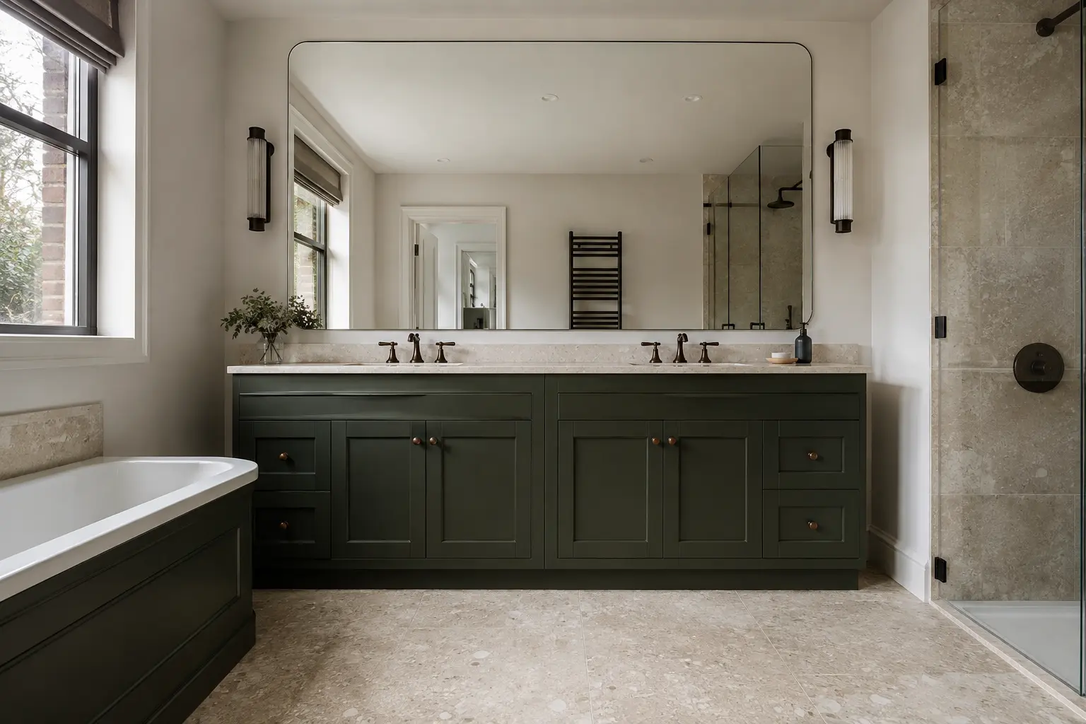
Use dark finishes where they help the design
Dark green, charcoal or deep timber tones can work in a bathroom with limited daylight, but the amount and position matter. A dark vanity against lighter walls creates a different result from dark finishes on every surface. Decide which feature you want to notice first and keep the surrounding choices coordinated.
Do not assume that using a dark colour means the room must become impractical or gloomy. Equally, avoid promising that lighting will make any combination work. Check the proposed materials and light positions together. If the room feels too enclosed with the samples, reduce the extent of the darkest finish before changing every product or abandoning a colour you otherwise like.
Choose pale finishes without making everything flat
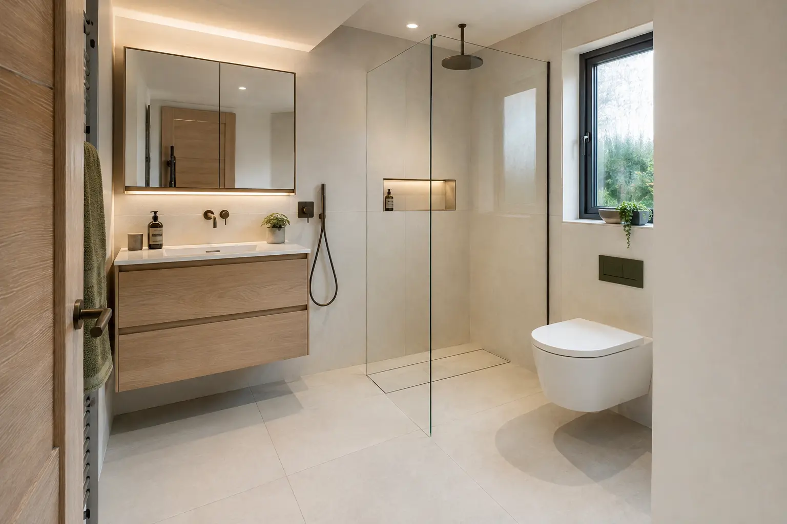
Pale tiles and panels can help a room feel brighter, but an entirely white scheme is not the only option. Warm stone colours, muted greens and timber tones can add interest while keeping the main surfaces light. Look at texture and pattern as well as colour. Several pale patterns used together can still make a compact bathroom look busy.
Pick one or two finishes to provide the main interest and let simpler surfaces sit beside them. This is a practical way to coordinate choices, not a rule that every room must be minimal. Check how grout and trims affect the final appearance. Their colours can strengthen or soften the pattern even when the tile itself remains unchanged.
Put useful lighting before decorative effects
The mirror, shower and general room each need suitable light for normal use. A single attractive fitting may leave shadows where you wash or shave. Discuss positions before the electrical work and wall finishes are completed. Products need to be suitable for their bathroom location and installed appropriately; the appearance comes after those requirements.
Compare how the proposed light affects the selected materials. Very different light colours in one small room can make finishes look inconsistent. Ask for the intended effect to be explained in everyday terms rather than selecting a technical number without context. Useful lighting should make the bathroom comfortable to use, with decorative features supporting that purpose rather than replacing it.
Use mirrors and reflections sensibly
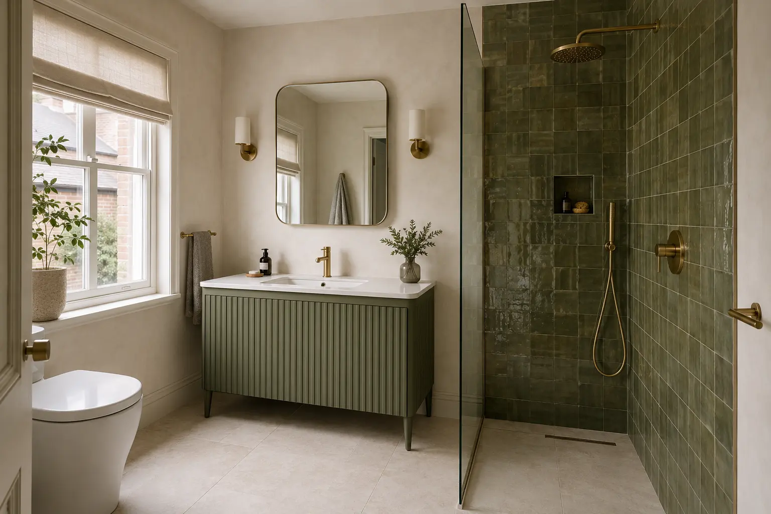
A mirror is useful for grooming and can reflect light from the room, but it cannot create daylight or physical space. Position it where it serves the basin and the people using it. Check what it reflects from the doorway as well as how it looks above the furniture. A large mirror is not automatically the best choice if it conflicts with storage or lighting.
Glossy surfaces can reflect more of the room, while matt finishes can provide a softer appearance. Both still need appropriate care and product suitability. Try samples rather than assuming one finish will always look brighter or more expensive. Reflections, visible water marks and cleaning preferences are part of living with the bathroom, not just styling it for a photograph.
Confirm the whole finish list
Before ordering, record the selected wall finish, floor, furniture, taps, grout and trims. Include the exact product names and colours, since similar descriptions can refer to different materials. Check any proposed substitution with the other samples. A replacement that looks close on its own may change the way the finished room comes together.
Keep a simple reference photograph of the agreed sample set alongside the written list. At delivery, check that the supplied products match the order before they are fitted. You do not need dozens of colour options to make a good choice. It needs a few suitable finishes seen under realistic light and chosen for the bathroom you will actually use.